Example
Pie Graph
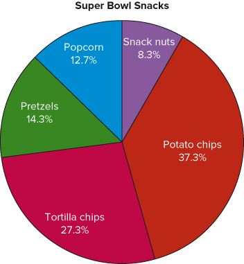
This frequency table shows the number of pounds (in the millions) of each snack food eaten during the Super Bowl.
| Snack | Million Pounds (frequency) |
| Potato Chips | 11.2 |
| Tortilla Chips | 8.2 |
| Pretzels | 4.3 |
| Popcorn | 3.8 |
| Snack nuts | 2.5 |
| Total (\(n\))=30.0 |
We need to break the circle (the pie) into different parts which represent the proportion of each class, this is (perhaps) easiest done by dividing the degrees into the parts.
Step 1: Split up the degrees
\[\text{Degrees}=\frac{f}{n}\cdot 360^{\circ}\]
Where \(f\) is the frequency for each class and \(n\) is the sum of all of the frequencies. Hence we have the following degrees split up:
Potato Chips:
\[\frac{11.2}{30}\cdot 360^\circ=134^\circ\]
Tortilla Chips:
\[\frac{8.2}{30}\cdot 360^\circ=98^\circ\]
Pretzels:
\[\frac{4.3}{30}\cdot 360^\circ=52^\circ\]
Popcorn:
\[\frac{3.8}{30}\cdot 360^\circ=46^\circ\]
Snack Nuts:
\[\frac{2.5}{30}\cdot 306^\circ=30^\circ\]
Step 2: For the labels the degrees don't communicate very well so use a percentage instead
Potato Chips:
\[\frac{11.2}{30}\cdot 100=37.3\%\]
Tortilla Chips:
\[\frac{8.2}{30}\cdot 100=27.3\%\]
Pretzels:
\[\frac{4.3}{30}\cdot 100=14.3\%\]
Popcorn:
\[\frac{3.8}{30}\cdot 100=12.7\%\]
Snack Nuts:
\[\frac{2.5}{30}\cdot 100=8.3\%\]
Step 3: With a protractor and a compass draw the graph using the appropriate degree measures.

To see this done watch the following video: